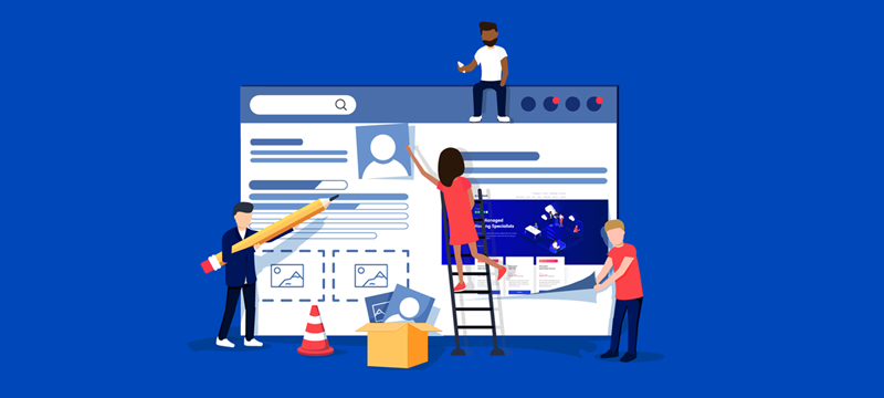
As you may have noticed, we’ve just launched a brand-new website at eukhost which has been designed to improve the customer experience. We wanted to make it easier for our visitors to find what they are looking for, understand what we’re saying and carry out actions. As most of our customers run their own websites, we thought it would be a good idea to share some of the improvements we have made so that you can see if they might be useful to you. Here are the main ones.
New branding
Branding is important because it helps customers identify a company and can be something easily remembered. Our new branding includes a simplified version of our name: we’ve changed from eUKhost to eukhost. Dropping the capital letters makes the name easier to read and type. More importantly, it reflects how our business has grown although we remain a UK based host, we look after customers around the world. We think the lower-case uk represents this better.
We also have a new logo, which is a simple design but with many connotations. At first, it looks like a three-dimensional cube; this gives an image of depth, solidity and robustness. On closer inspection, the two sides of the cube represent the E and U from the start of our name. Cleverly, these are made up of bars that give an impression of server stacks, thus reflecting the service we provide.
As you can see, considerable thought has gone into the new branding. Perhaps when updating your website, you can look at ways to improve your branding too.
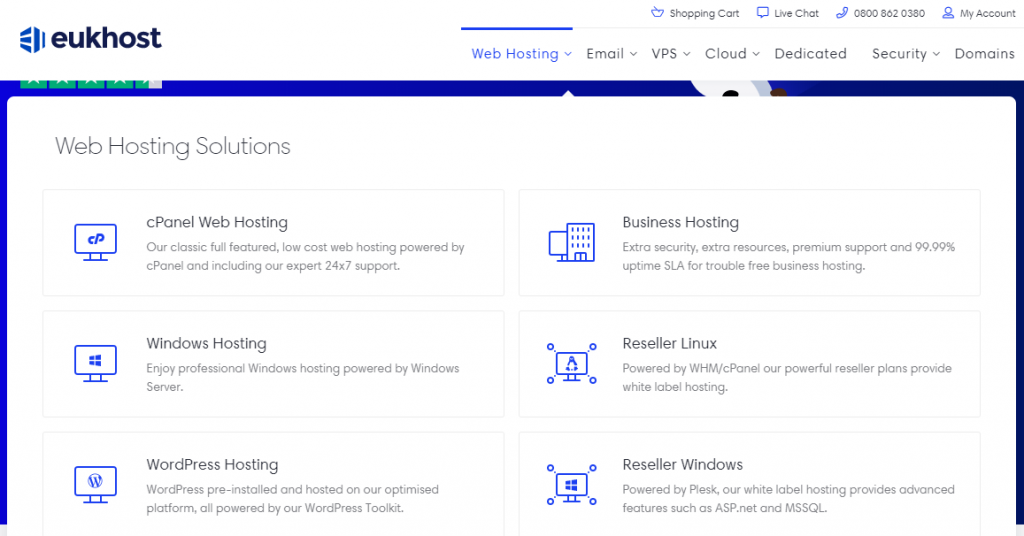
Better navigation Our new menu has been designed to make it much easier to find what you are looking for. Now, when you click on a top menu item, a dialog box appears on the screen one that stays in place without having to hover the cursor over the top. With so many subsections, the dialog box lays these out in an easy to find a way. Each subsection is clearly separate and has a heading, description and icon to help visitors understand what they will find if they click through. To identify which item you are on, a blue box highlights a section when the cursor is over it.
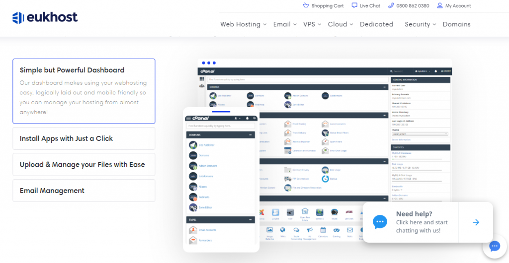
More helpful layout Websites with lots of information can become over-complicated and this doesn’t give the user the best experience or guarantee that they will find the information they need or the content you would like them to see. To overcome this, we have used a range of ways to improve our layout, breaking up long pages into sections that perfectly fit the screen and using background colours and headings to identify when a new section begins. We’ve also used a number of features within each section to make the information more accessible, for example, using collapsible boxes, each of which opens with a detailed illustration, as you can see below.
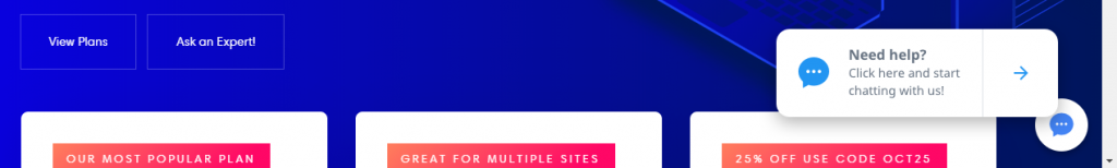
Making it easier for customers to get answers When it comes to selling your products or services online, customers often need assurance that what you are offering is exactly what they are looking for. If the information on the website doesn’t answer all their questions, there is a good chance they’ll not feel confident enough to make the purchase. One way to ensure that they get the answers they need is to provide direct contact with your team. While telephone and email are options you can offer, online chat is far more helpful as there are no queues and the response is immediate, ensuring you can provide assistance while the customer is still on the site. We’ve used live chat on all our website pages for a while. However, in the new version, we’ve made it clearer that it is there to help, as you can see in the image below. You’ll also notice that, in addition, we’ve added Ask an Expert button to key areas of the actual content.
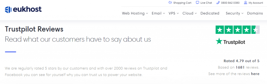
Social Proof Any company can wax lyrical about how great it is or how fantastic its products are on its website but today’s savvy customers aren’t going to take this at face value. To be convinced that you are as good as you say you are, customers will want to see proof and these days, that comes in the form of reviews and ratings. To give potential customers the chance to see what other clients think about us, our new website has made it even easier for them to read reviews made on the highly respected, independent review site, Trustpilot. We’ve even made a feature of this on our web pages and linked to our reviews so you can read them directly.
Conclusion
Customers really appreciate user-friendly websites that go out of their way to make things easier for them. On our new website, we’ve tried to do this through clearer branding, simpler navigation, a more helpful layout, easier to access chat and social proof. We’ve also made our written text less difficult to understand, reduced unnecessary jargon and used images which better illustrate the content. Hopefully, you’ll find some of these ideas useful when next updating your website.
I'm an experienced digital marketer with expertise in planning, SEO, SEM, and social media. I'm good at creating engaging content and optimising campaigns for a strong online presence.
I'm an experienced digital marketer with expertise in planning, SEO, SEM, and social media. I'm good at creating engaging content and optimising campaigns for a strong online presence.